Work
Brand identities, products and design systems.
Case studies from fintech startups, venture studios, SaaS companies and consumer brands, each one taken from first concept to launched product.

01
Sprintr
Brand Refinement
Sprintr AI had a strong brand idea buried under brand elements used without direction. It didn't need more or better elements. It needed hierarchy: the right amount, proportion, structure and harmony. I audited it, rebuilt the S logo for optical balance and gave the brand a direction to follow.

02
Growth Factory Ventures
Rebrand
Growth Factory Ventures had a sharp point of view and a logo that didn't. I rebranded the firm around a single G built from the ideas it runs on, then grew it into a system: a 7×7 grid, a palette built on green and type that fits a very long name.

03
CREE8 Product Design
Product & Design System
CREE8's product was a Frankenstein of screens with no consistency, clarity or room to scale. Working with CEO Lisa Watts, I rebuilt the experience and the design system behind it, then connected that system to code so a prompt can now produce on-brand CREE8 UI.

04
CREE8 Redesign
Brand Redesign
CREE8 had a good idea and a stock-image logo. I rebuilt the brand from zero around an infinite loop that doubles as an 8, picked the one color nobody in the industry was using, and designed and built the new website in Framer.
05
Bubble8 Venture Studio
0-to-1 Brand Identity
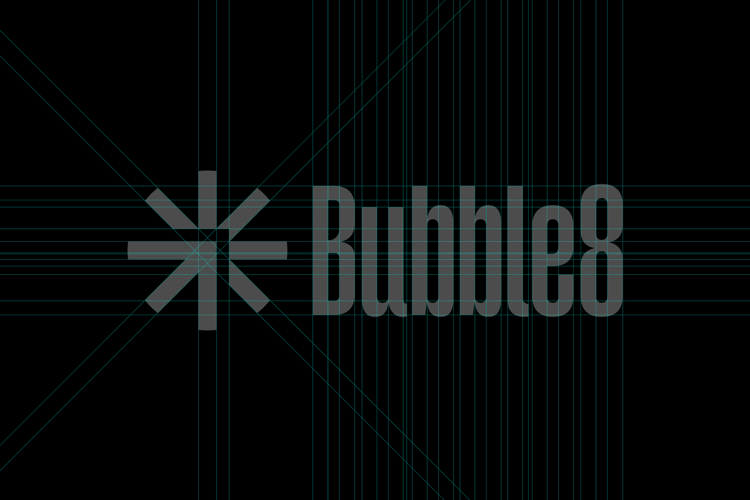
Bubble8 was a venture studio built on one philosophy: ship, validate, repeat. I turned that into a single mark: the arrow is the studio, the spikes are the ideas it pushes out to market. Black and white on purpose, because the ideas were meant to shine, not the studio.

06
Higlobe
Design System
Higlobe helps people get paid across borders. My biggest contribution was the design system the product still runs on, and the rule behind every flow: let the tech do the heavy lifting, and only ask the user for something when it's strictly necessary.

07
RedDoor
Brand Identity
RedDoor wanted to be seen as a solid player, not just an app: a whole tech stack behind one mission, one-click homeownership. I redesigned the brand from a triangle, a circle and a square, and gave it room for three products with very different personalities. Then Opendoor acquired the company.