0-to-1 Brand Identity
Bubble8 Venture Studio
Client
Bubble8
Industry
Venture studio
Role
Brand Designer
Year
2023
Services
Brand strategy, Brand identity, Logo design
Tools
Figma, Illustrator, Photoshop
One shape, one message: we ship.
A year after Ali Mackani and I exited our first project together, RedDoor, he reached out with a new one: Bubble8, a venture studio that builds companies by testing ideas in the real market, fast. I designed the brand from scratch. Bubble8 later added CREE8 to its portfolio and, after months of hard work, joined Growth Factory Ventures as The Studio.
A venture studio's job is to not fall in love with its ideas. Most of them should meet the market early, and some won't survive the meeting. The brand had to say that out loud: a studio that moves fast, ships often and lets the market decide, without looking like one more VC firm or agency, and without stealing the spotlight from the ideas themselves.
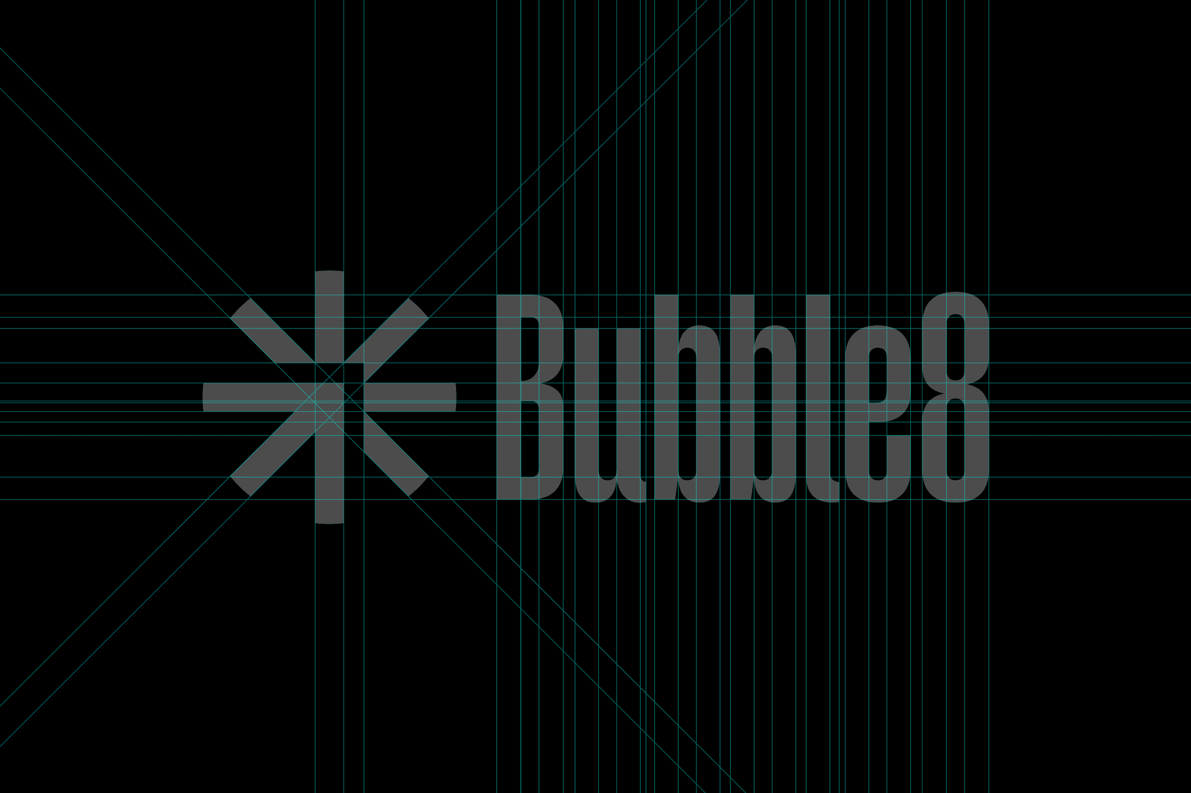
The mark was clear in my head as soon as the studio's purpose and vision were settled. The arrow is the studio, always moving forward. The spikes are the ideas it pushes out, each one a bet that gets validated quickly or let go. There are eight of them, a quiet nod to the name, and the whole mark runs on one geometry: one stroke width, and a center cut that follows the diagonals. The hard choice was the type. I landed on Gazzetta, a very strong typeface that holds its own next to the mark. Black and white was deliberate: Bubble8 was the layer behind the ideas, so the ideas get the color, not the studio. The badge became a signature too: every idea we took to market carried it in its website footer as "A Bubble8 Co."
A mark that explains the studio's model at a glance.
A badge that signed every company the studio took to market: "A Bubble8 Co."
An identity that carried Bubble8 through testing ideas in the market, keeping the ones that worked and letting go of the rest.
A studio that added CREE8 to its portfolio and joined Growth Factory Ventures as The Studio.
The process
Round two
Ali and I had already exited RedDoor together. A year later he came back with a studio, and this time the product was the process itself: build, ship, learn. The mark was clear from the start. The typeface wasn’t: it took a while to land on Gazzetta, strong enough to stand next to the mark. And everything stayed black and white, because Bubble8 was the layer behind the ideas.
The arrow and the spikes
The arrow is the studio. The spikes are the ideas. The studio’s job is to push them out into the market, see which ones stick and move on from the rest. There are eight of them, a nice nod to the name, and the whole mark runs on one geometry: one stroke width, and a center cut that follows the diagonals.
Don’t get attached
Shipping fast means some ideas don’t make it. A few of ours went to market and didn’t go well, which is exactly what validation is for. Every idea we launched carried the badge in its website footer, “A Bubble8 Co.”, so the studio signed its work without stealing the show. The ones worth keeping got the work, and CREE8 joined the portfolio.
Where it landed
Validate quickly, back what has signal, let go of the rest. That’s also how Growth Factory Ventures works, which is why Bubble8 joining GFV as The Studio made sense. Same philosophy, bigger engine.
Next project