
Brand Redesign
CREE8 Redesign
Client
CREE8
Industry
SaaS / Creative collaboration
Role
Head of Design
Year
2024
Services
Brand strategy, Positioning, Brand identity, Motion, Web design
Tools
Figma, Illustrator, Photoshop, After Effects, Premiere Pro, Framer
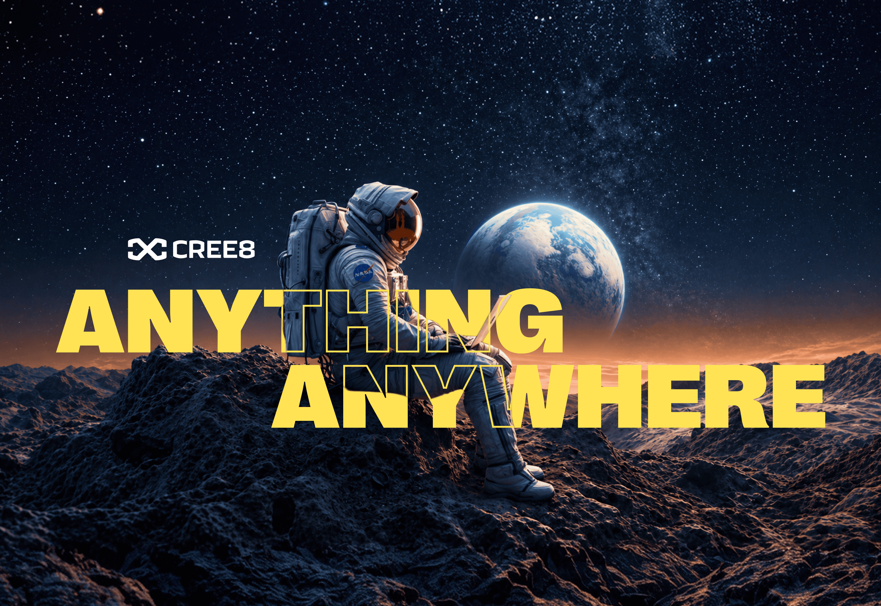
Anything, anywhere: a big promise in a loud yellow, impossible to ignore.
CREE8 (say it out loud: create) builds cloud workflows for film, TV and broadcast teams. After it acquired BeBop Technology, we retired the BeBop name and started fresh. As Head of Design, I rebuilt the brand from zero and carried it into a new website I designed and built myself, around a positioning we shaped as a team: Studio In-A-Box.
The old logo was a stock image with a good concept behind it and nothing that made it CREE8's. No guidelines, no system, nothing to inherit. And the brand sat in the same blues, purples and magentas as almost everyone else in the industry. A company starting fresh needed a brand that didn't blend in.
We knew the direction from day one: an infinite loop that is also an 8. Getting there took many explorations until the mark felt simple and sure of itself. For color, the logic was simple: if CREE8 is different from everyone else in the market, it should look it. I took a purple from CREE8's world and went to its exact opposite on the color wheel: a loud yellow. The type kept evolving with the brand until it found its match in a grotesk. Then I designed and built the website in Framer and set up its content and component strategy, so the brand can keep growing without starting over.
A brand built from zero: mark, color, type and website.
A yellow that broke the industry's blue-purple pattern.
A Framer website with a content and component system the team keeps growing.
A cautious reaction inside the company, and a warm one outside it, from clients, prospects and users at events like NAB.
People still stop us to say they love the brand. Their words: "You guys are impossible to ignore."
The process
Starting from nothing
The previous logo came from a stock image. Good concept, generic execution, zero guidelines. With BeBop retired too, this was a whole new start, not a refresh.
Anything, anywhere
We knew we wanted an infinite loop that is also an 8. We didn’t know how to make it happen, so it took many explorations to get there. CREE8 sounds like create, and a loop never ends, which is the point: anyone can work on anything, from anywhere. Big claim. The brand had to be confident enough to make it.
The yellow
Almost every brand in the industry lived in blues, purples and magentas, and so did CREE8. The color wheel gave us the reason, but the real argument was simpler: if we’re different from everyone else, let’s look different and be impossible to ignore. So I took a purple and went to its exact opposite: a vibrant yellow, and a lot of nervous faces internally.
Out in the world
The industry didn’t share the nerves. Clients, prospects, and users loved it at events like NAB and beyond. People still stop just to say they love the brand and the color. As a designer, that means the world to me.
The website
I designed and built the new site from scratch in Framer, and I run its content and component strategy. It’s the brand’s first full expression, built around the Studio In-A-Box story, and it’s made to evolve as fast as the positioning does.
Next project